Top 10 tips you must put in place today to create an amazing SharePoint list user experience
![[object Object]](/_next/image?url=%2Fimages%2Fauthors%2Fdan_carroll_grad.jpg&w=256&q=75)
🧐 So whats this all about?
SharePoint Online lists and document libraries can be pretty bleak places to spend time. Most often, they are set up in a way where the user experience is the last priority... tut tut...
Now, me being a user experience nut, this kind of thing keeps me up at night!
I was thinking about this recently and decided to jot down my top 10 list of things I always do/consider when I create a list or library to try to ensure it is happy place for the people who will work within it.
This list has always served me well and hopefully, will do the same for you!
Many of the things in this list are actionable today... this minute! I have rated them on difficulty to implement on a scale of 1 - 3 coffee cups (1 coffee cup being the easiest 😉).
So without further adue, here are my...
Top 10 things you can do to instantly improve the SharePoint list user experience!
- 1. ✅ Ensure you are setting column appropriately
- 2. ✅ Try to avoid horizontal scroll as much as possible
- 3. ✅ Leverage lookup columns for reference data
- 4. ✅ Limit the amount of columns displayed. Use row details panel for more detail
- 5. ✅ Add structure and categorisation to the row details panel
- 6. ✅ Don't create a 'Comments' column. Use the list commenting feature!
- 7. ✅ Apply row formatting to help with accessibility
- 8. ✅ Set up the filters pane yourself. Don't trust SharePoint
- 9. ✅ Create list views for common use cases or tasks
- 10. ✅ Do everything you can to make your list beautiful and engaging!
1. 🎯 Ensure you are setting column widths appropriately

Easy
With column widths, there are basically two things we want to pay attention to.
- Column Label Width - This is the first priority. We want to make sure this is not truncated (i.e. half the label not being visible). A column with unclear representation won't be appreciated. Be kind to others and make sure your column labels are readable!
- Column Data Width - Address this after column width. Essentially we want to adjust the width of our columns so that the data which they contain is legible. In particlular, I'm talking about the 'Multiple Lines of Text' column. We generally want to widen this one so that the text doesn't wrap every couple of words.
Essentially, it's a dance between keeping the labels legible (and short if you can) and also making sure the width is also appropriate for the data within. All with an over arching objective of keeping the horizontal width of the entire list to a minimum.
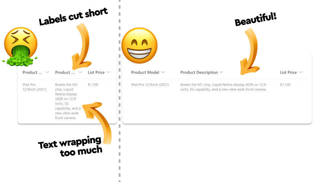
Column label width in SharePoint Online Lists
So how on earth do you adjust the width of the columns?! Adjustusting the width of a column is simply a matter of hovering your mouse to the right of the column you wish to adjust and when you see the double arrow, click and drag.
Important!: Don't forget to save your view after adjusting the width of a column so that your chnages are saved!
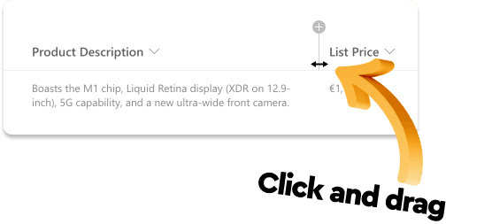
Changing column labels widths
2. 🎯 Try to avoid horizontal scroll as much as possible

Not Bad
Horizontal scroll is one of those things that designers avoid like the plague. You should do the same!

Avoid horizontal scroll
Keep this in your mind as a general design principle in SharePoint lists and document libraries!
The next few tips will give you some options to avoid this scenario. It can't always be avoided so don't go breaking your neck to make it happen but, just do your best to avoid it. Lookup lists, multiple views and relying on the item details view will see you right (as i'll explain on the next few points)
3. 🎯 Leverage lookup columns for reference data

Difficulty - Big Enough!
Ok, a few things to unpack here...
What do I mean by reference data? Reference data (according to Dan and in the context of SharePoint lists) referes to data that is related to whatever the rows in your "primary" list represent but, are not fundamental in terms of their definition. Kind of like information that is once removed.
So for example, in my 'Asset Tracking' list, I have rows representing tech items. One of the columns in my list is 'Vendor'.
'Vendor' is important to my list so needs to be there. However, information about the vendor (such as the vendor's contact information) is useful and could be required but it is not essential to my list. Therefore I can consider it 'once removed' and something I can reference from some other location or list. I.e. it is reference data.
What the hell is a lookup column? A lookup column is a type of coulmn which you can add to any SharePoint list or document library and essentially, it allows you to pull in information from a seperate list (such as reference data!🤓).
So in my 'Asset Tracking' list, I have a Lookup Column called 'Vendor' which looks up a list of vendors (reference data) which I maintain in a seperate list on my site called 'Vendors'.
Doing this allows me to have a managed list of vendors which I can choose from within my Asset Tracking list.
I can then store all the vendor realted info in the reference list and have it accessible from my Asset Tracking list without needing to store and maintain it there and of course, now it won't clutter up my Asset Tracking list!
It also means that if I update anything about the vendors in the vendors list, I don't have to update every row in my primary list. Any updartes in a lookup list will be refelected in the primary list.
I know, that was a bit of a tongue twister! Watch my video on this topic, it should help.
For now, here's a nice image to illustrate the point!
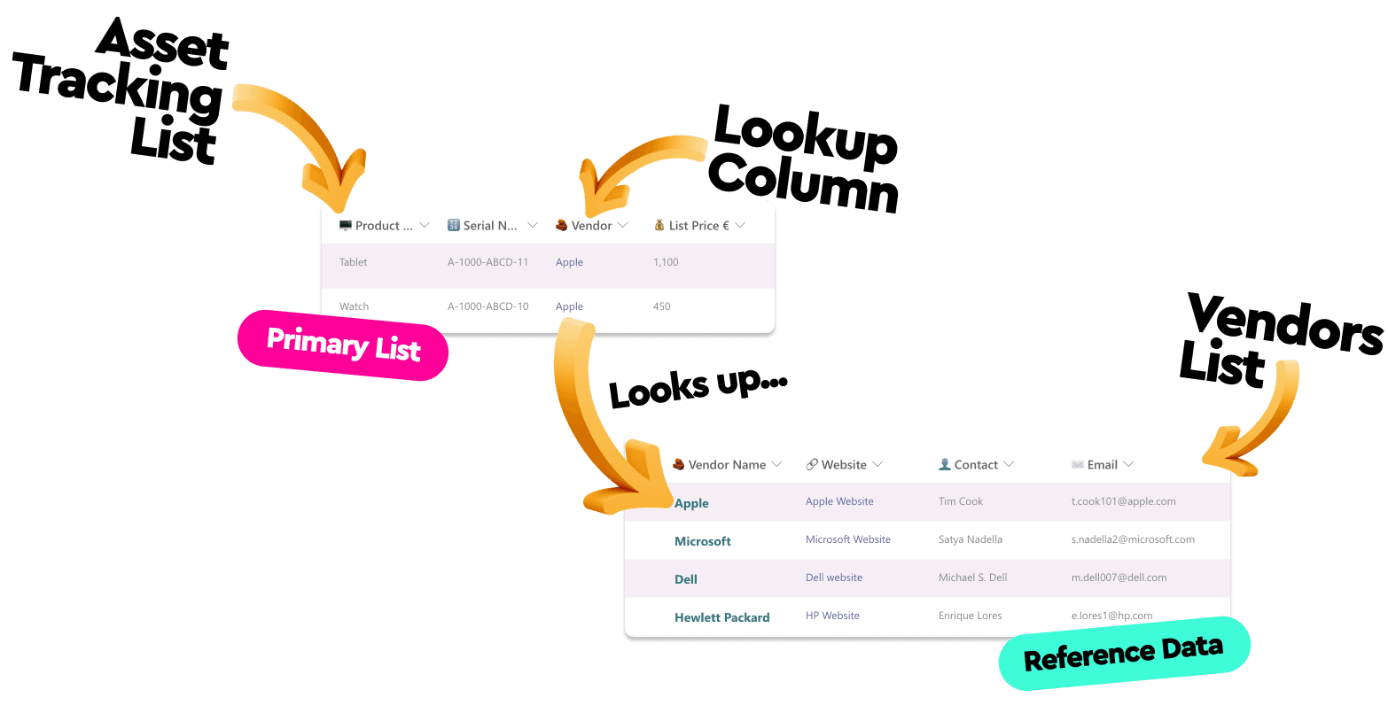
Look up list & reference data
4. 🎯 Limit the amount of columns displayed. Use row details panel for more detail

Difficulty, Easy!
Not many people are aware of this but... just because you have 20 columns within your list or document library, doesn't mean you have to display 20 columns within your list or document library views!
Here's how I like to look at it...
When I have a list that must contain a large amount of columns, I try to decide what is absolutely essential to display in an at-a-glance view of the list so that somebody can easily distinguish the important details of one row item from another. Everything esle is hidden from the list view.
I then always place a very clear 'View' button on the rows so that people know where to go to 'view' more details about the row.
Clicking this button, will display all the information contained in the list relevant to that row item.
This is massive in terms of keeping our list views clean and avoiding the dreaded horizontal scroll!
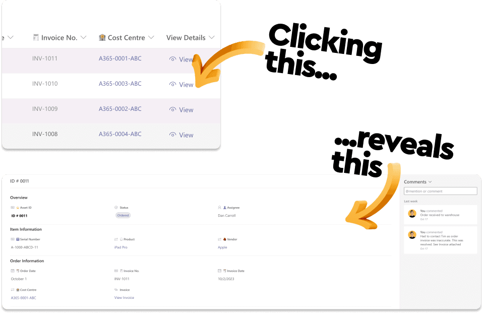
View details button
Adding the view button is easy peasy!
All you need to do is:
- 1. Create a new 'Text' column called 'View Details'
- 2. Go to 'Column settings' (by clicking the dropdown to the right of the column label) and then click 'Format this column'
- 3. Click 'Advanced mode'
- 4. Paste in the code below exaclty and click 'Save'
{
  "$schema": "https://developer.microsoft.com/json-schemas/sp/column-formatting.schema.json",
  "elmType": "button",
  "customRowAction": {
    "action": "defaultClick"
  },
  "attributes": {
    "class": "ms-fontColor-themePrimary ms-fontColor-themeDarker--hover"
  },
  "style": {
    "border": "none",
    "background-color": "transparent",
    "cursor": "pointer"
  },
  "children": [
    {
      "elmType": "span",
      "attributes": {
        "iconName": "View"
      },
      "style": {
        "padding-right": "6px"
      }
    },
    {
      "elmType": "span",
      "txtContent": "View"
    }
  ]
}
5. 🎯 Add structure and categorisation to the row details panel

Difficulty, Easy!
Directing people to the details view of a list item like we did in the previous step is great BUT, it's not going to provide a great user experience unless we add a little structure.
As a general user experience principle, it is always a good idea to group long lists of information into categories (that's why we have dropdown menus in website navigation!)
We want to avoid this...
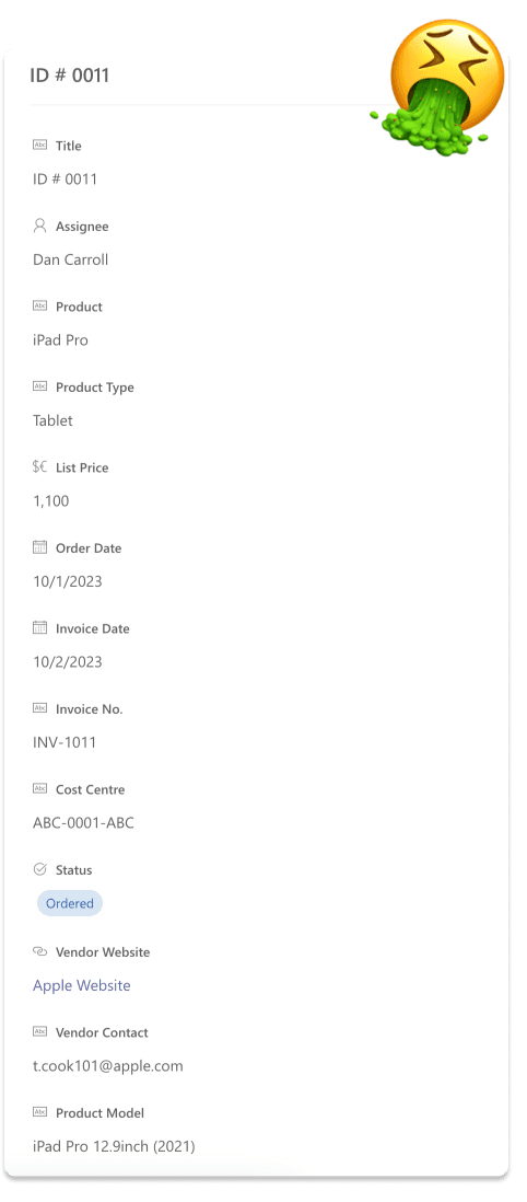
List details view with a poor user experience
and instead, introduce categories to group our data. Like this...
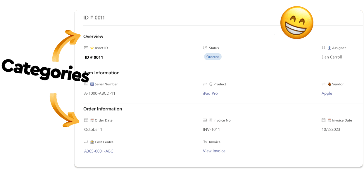
Categorised list details view with a great user experience
This is pretty straight forward. When you have decided how you want to categorise your information do the following.
-
- Open an list item and select 'Configure layout'

Adding categories to the list details view
-
- Select 'Body' in the 'Apply formatting to' dropdown
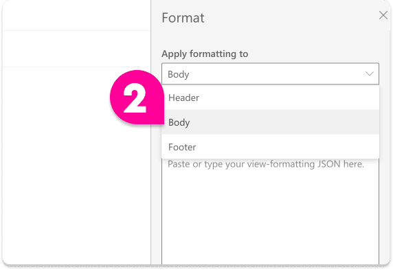
Adding categories to the list details view
-
- Paste in the following code
{
    "sections": [
        {
            "displayname": "Overview",
            "fields": [

            ]
        },
        {
            "displayname": "Item Information",
            "fields": [

            ]
        },
        {
            "displayname": "Order Information",
            "fields": [

            ]
        }
    ]
}
Change the display names to any names you wish. These will be the categories. You can also add or remove as needed by following the pattern in the code.
- 4. Click 'Save'
- 5. Refresh the page in the browser to see the changes.
Now, at this point we have created categories but, we have't added any columns to them. You can do this in the code but it can get messy! There is an easier way to do this.
- 6. Again, open any list item but this time, select 'Edit columns'
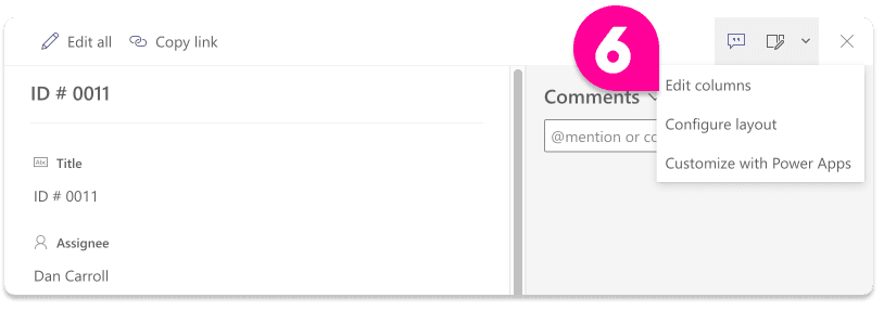
Adding categories to the list details view
- 7. Now simply drag and drop the relevant columns into the relevant categories and click 'Save'
Note: from this screen, you can also choose to hide certain columns. It's a good idea to hide the 'View Details' column as it's not needed (we just used it so we could create the button and hiding it here will not hide it from the view!)
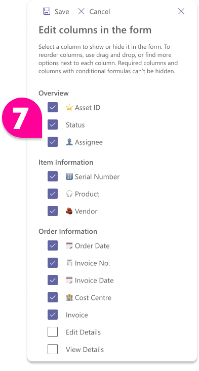
Adding categories to the list details view
- 8. Refresh the page in the browser again and you should see your new fancy pants categories details view!
6. 🎯 Don't create a 'Comments' column. Use the list commenting feature!

Difficulty, Easy!
This one is more of an awareness thing.
So I tend to see alot of people creating a dedicated column within lists and document libraries for the sole purpose of capturing comments and notes on rows.
Don't do this!
There is a commenting feature built into all lists and document libraries which is far superior to anything you can create yourself!
To access it, open any row (or click the view button we created above) and you will see the commenting feature. THis allows for comments to be captured way more efficiently than a column.
So make yourself and your trusty list collaborators aware of it and agree that that is how you will capture comments or narrative!
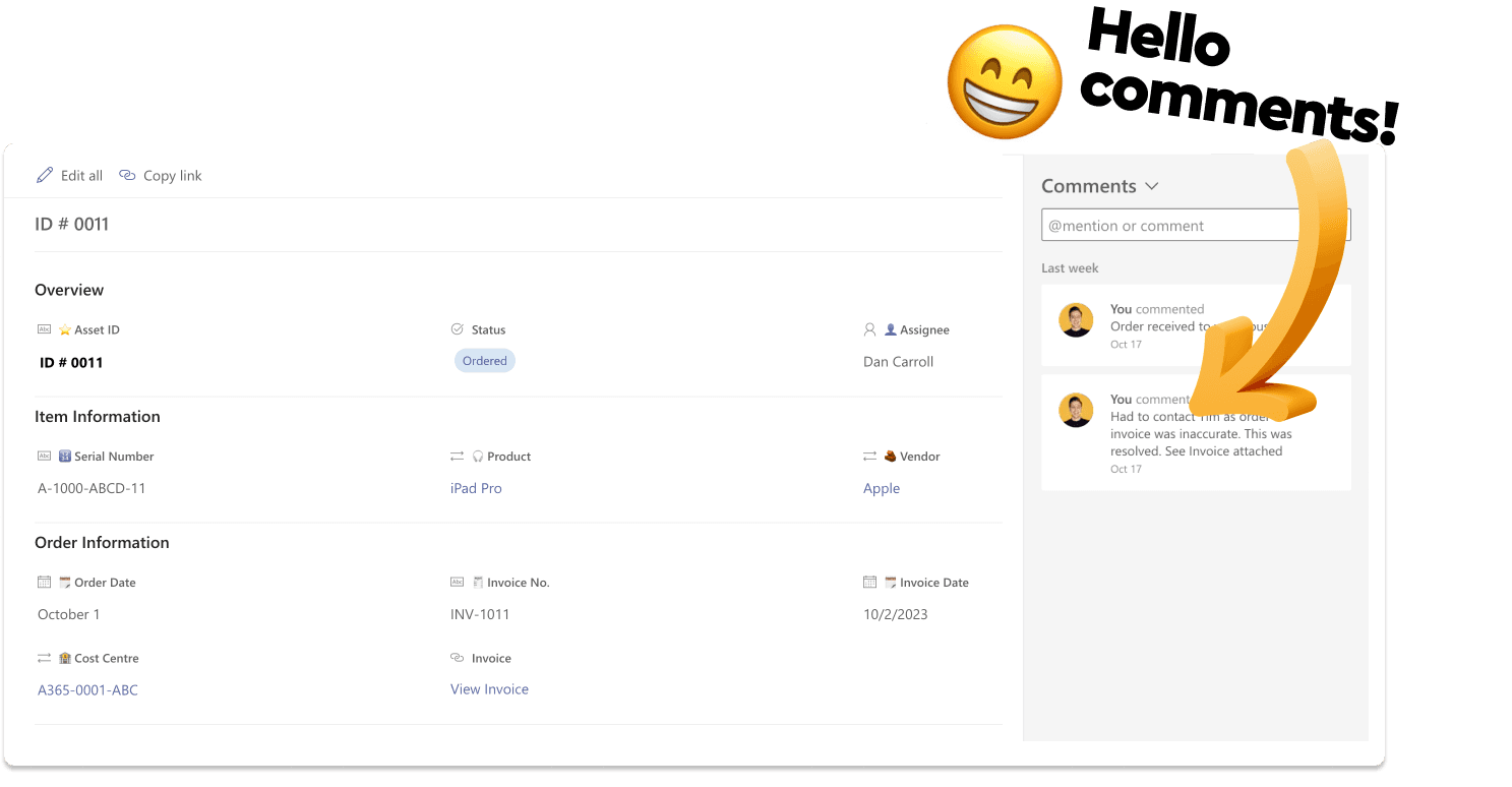
Using the built in commments functionality
7. 🎯 Apply row formatting to help with accessibility

Difficulty, Easy!
This one is the simplest thing on this list to implement but can be arguable the most impactful and desired!
What I mean by "Adding contract between rows" is essentially adding a background color to every other row so it's easy to scan along a row without your eyes going fuzzy!😵💫
Best illustrated with a diagram...
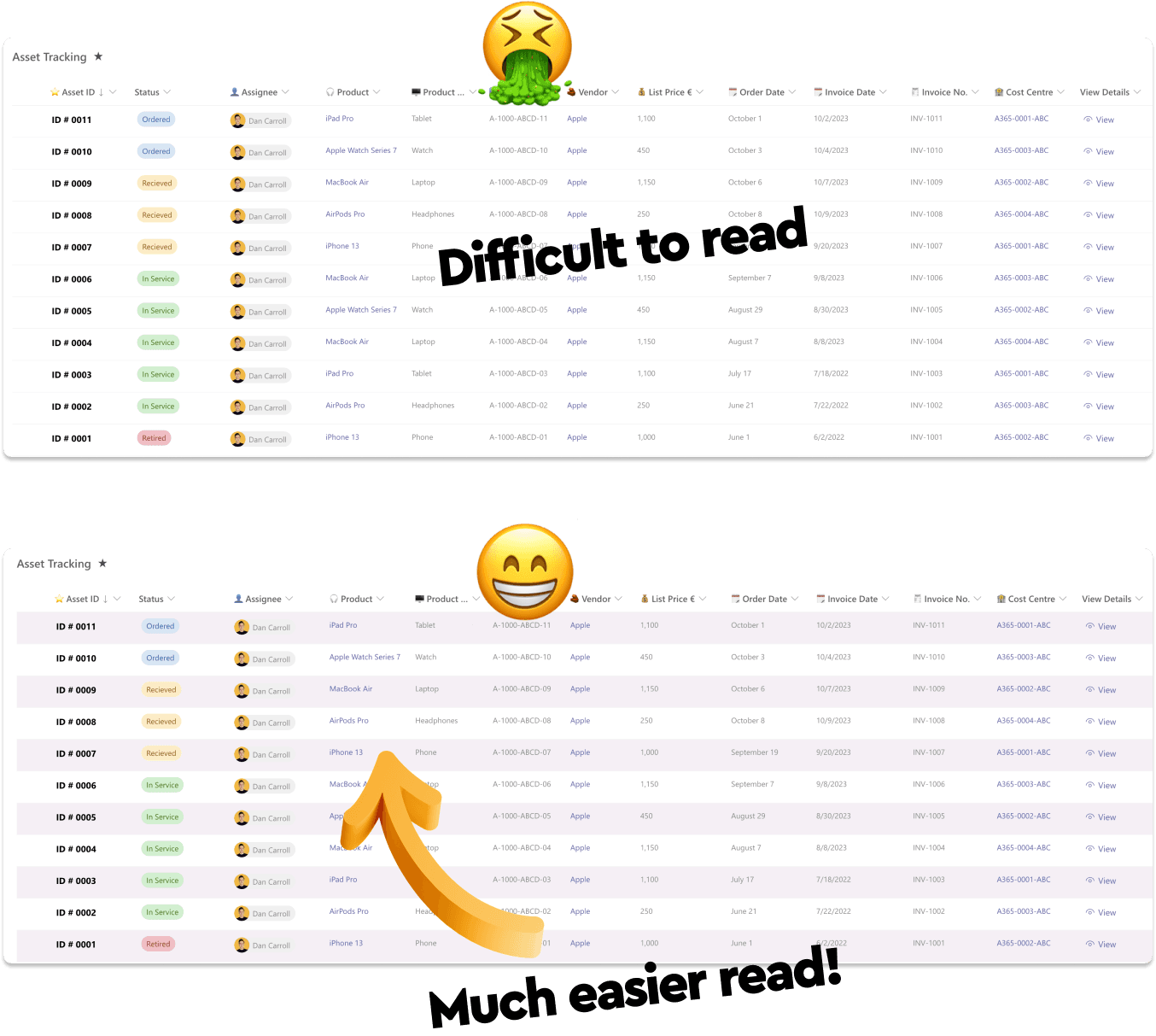
Add alternating row backgrounds to a list
To do this to your list or document library do the following:
- 1. Click the view dropdown
- 2. Select 'Format current view'
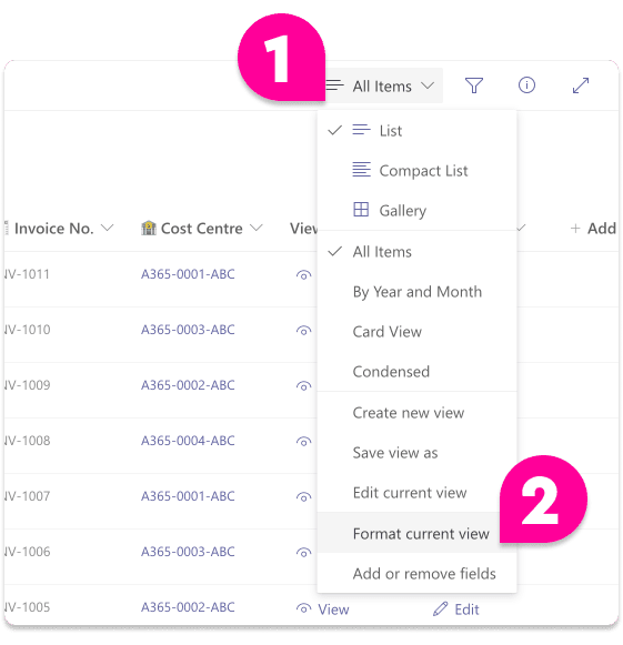
Add alternating row backgrounds to a list
- 3. Check the box next to 'Alternating row styles'
Note: You can edit the background color to something more fancy than gray if you cick 'Edit row styles'
- 4. Clcik 'Save'
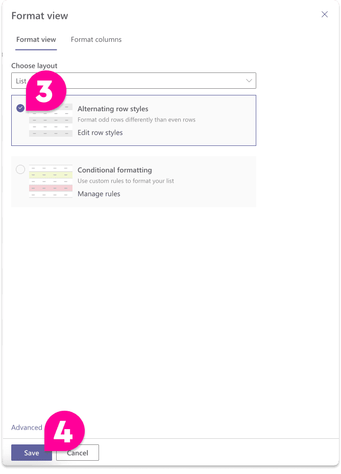
Add alternating row backgrounds to a list
Done! I told you that woudl be easy!!!
8. 🎯 Set up the filters pane yourself. Don't trust SharePoint

Difficulty, Easy!
Every list and document library allows you to apply ad-hoc filters to a list view.
You can access the filters pane by clicking the most obscure button ever...
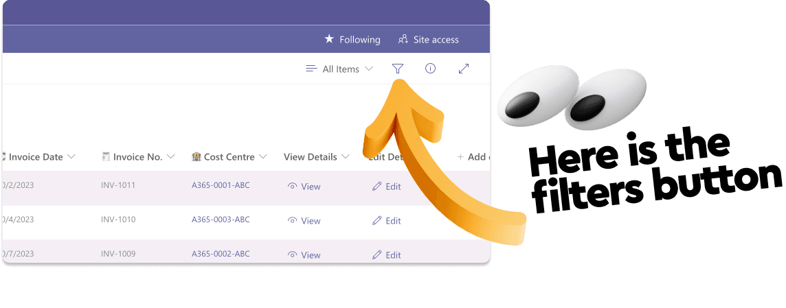
Setup list filters
However, the filters that are displayed within the filters may not always be the filters you want displayed. SharePoint has a mind of it's own when it decides what filter to include here (I'm sure there is some logic to it, but I've never figured it out!)
BUT... you can decide what filters you want to display here and it's quite easy to do so.
The magic phrase here is 'Pin to filters pane'
Here's what I typically do...
- 1. Open up the filters pane
- 2. Remove every filter displayed by clicking the three dots next to it and selecting 'Remove'
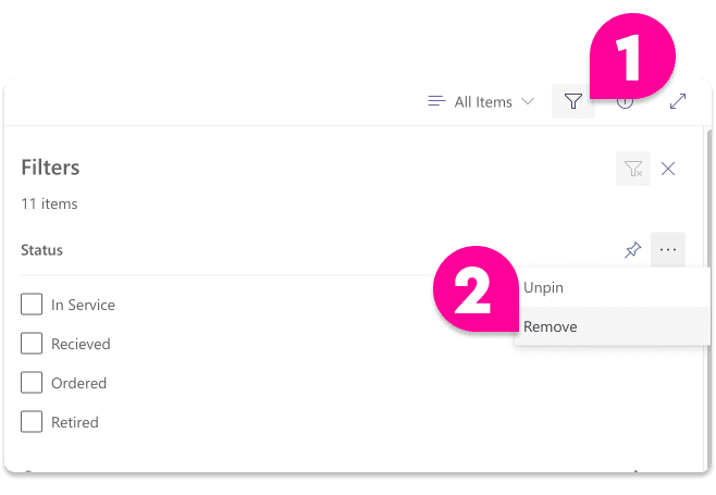
Setup list filters
- 3. Now, decide what filters you actually want to appear here (as in what columns you want to be able to filter by)
- 4. Click the drop down next to every column you want to be able to filter by and select 'Column settings' and then 'Pin to filters pane'
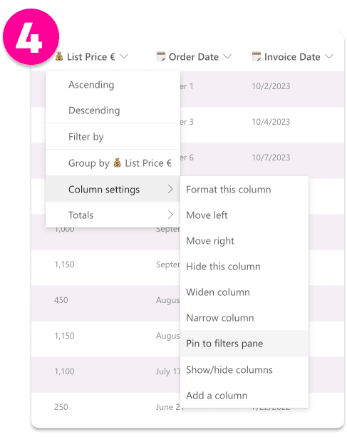
Setup list filters
Now you will have a well structured and 'by design' filters pane that displays meaningful filters!
9. 🎯 Create list views for common use cases or tasks

Not Bad!
So a as you probably know, a 'View' in a SharePoint list or document library a allows you to save any combination of applied filters, sorting, grouping and displayed/hidden columns so that you can easily apply them in a single click. Cool.
People typically use views to tailor a "view" of the list relevant to a specific task or use case.
So for example, the default view on my list is 'All Items'. This is a general "all purpose" view which allows me to identify key information about any row without being specific to a particular task...
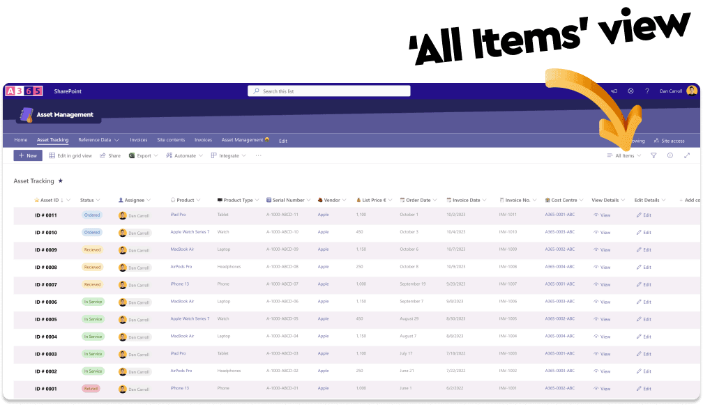
Create list views
However, If I want to have a more targeted view of the data in the last with the objective of understanding what items were purchase by year and by month, I can create a view which groups the rows in the list by year and then by month...
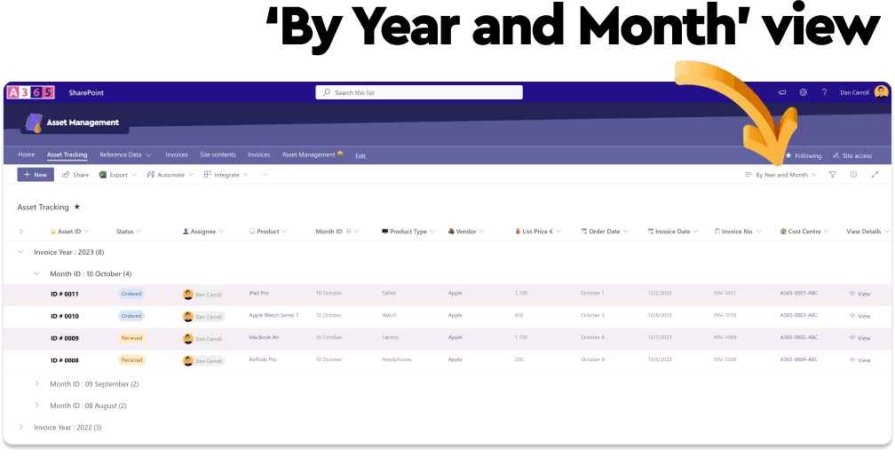
Create list views
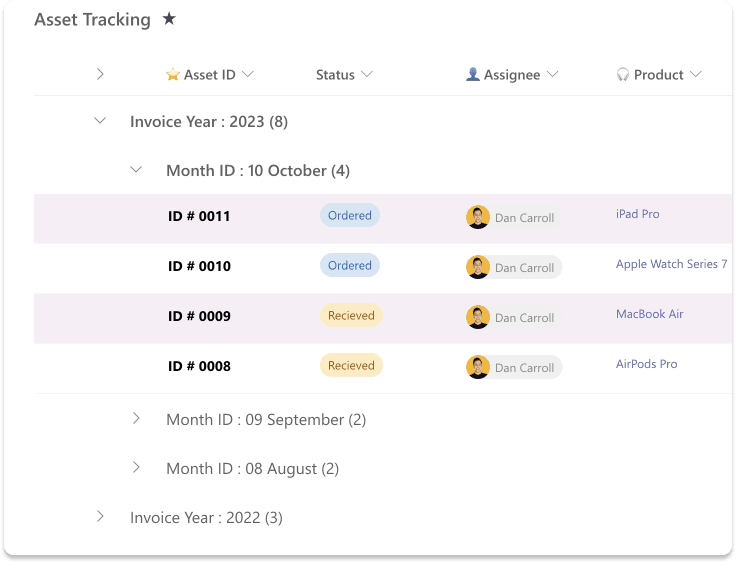
Create list views
Now, whenever I come to this list with the objective of getting an overview of the purchases for a particular month or year, all I have to view is select my custom view and away I go!
By leveraging 'Views' within your lists and document libraries you can show columns only related to the task at hand and this makes it much easier to create a better user experience within your list.
10. 🎯 Do everything you can to make your list engaging!

Difficulty, Easy!
This is a general one and with updates being made to SharePoint contantly, there are more and more opportunites for it.
The main thing here is to ask your self...
Is there anything I can do to this list to make it more engaging?!
More recently I have started to add emojis to column names to help them stand out more. I start to see emoji's used more and more in alot of the non-Microsoft Saas products I use and I like the effect. The feedback on this from my customers has also been very positive!

Add emojis to column labels
Tip! Don't create your columns with the emoji, create it with a standard text name and once it has been created, rename it with an emoki. The reason for this is that if you create the column with the emoji, the system name of the column will contain a code version of the emoji whihc can caomplicate things down the road. Take my word for it!
Play around with column formatting as well as the 'Gallery' layout to transform your list into a card based layout. You'll be surprised at what results you can get!
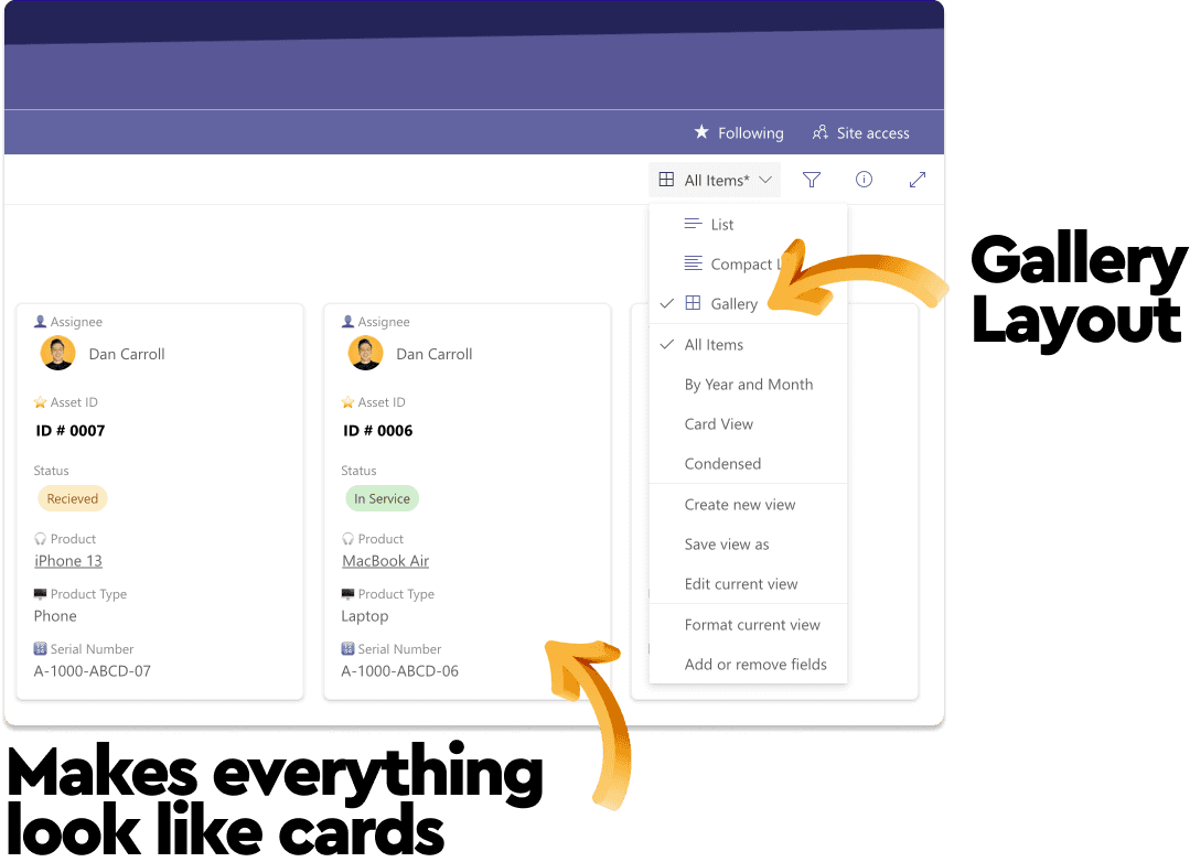
List gallery view
Tip! If you use the Gallery layout, click 'Format current view' within the 'View' dropdown and you can use the 'card editor' to tweak how the cards display. If you add an image column, you can really bring your cards to life!
Check out my YouTube video on this topic for bonus item 11 which deals with linking documents instead of using atachements! 😉
💡 Summary
So there you have it! A great list of things (many of which you can put into place right now) that will certainly improve the user experience of your lists and document libraries.
I'm not saying to use them all at once, you be the judge of what's practical or relevant to your situation, but you should at least consider them.
Happy SharePointing!
Until next time, Dan 😁
Dan Carroll's latest courses.

SharePoint Intranet Site Build Master Class
The aim of this course is to demystify SharePoint. We’ll cover all the features and functionality needed to build a modern department Intranet site, hyper-focused on providing an amazing end-user experience. In each course module, we’ll tackle a common Intranet requirement and build a solution, step-by-step, to meet it. After stacking these solutions, you’ll understand the underlying principles behind building a user-friendly and effective site. When you complete this course, you’ll be armed with the knowledge and skills to build or overhaul any Intranet site quickly and efficiently.
Featured Posts
If you found this post helpful, you might enjoy some of these other posts from the Knowledge Base.
Build a custom Netflix Search Experience In SharePoint Online using PnP Modern Search
The search experience within SharePoint Online is limited. In this tutorial I am going to show you how you can create a totally custom search experience for your users using the PnP Modern Search web parts

Dan Carroll